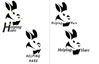
Vital Tips for Effective Logo Design
- Logos are used to identify a company or a brand.
- A good logo is when the meaning and concept is noticeable and the message is clearly conveyed to the audience.
- People think that it is so easy to create a logo, yes they are tiny, but they take a lot of thought and planning out to become perfect and usable.
- When it comes to logos, the simple the better. It is more memorable to the public, you want the logo to be easily recognized.
- The cost of a logo depends on the business, how many logo concepts are created, and how much the designer wants to charge the buyer.
10 Common Mistakes In Logo Design
- An amateur logo will make a business look amateur as well. Also, when the business tries to reproduce the logo, it might not look so neat and sharp as they wanted it to look.
- Trends are bad too! Cause they come and go really fast, so then you will have to redo the logo soon too.
- Do not use raster graphics such as on Adobe photoshop because when trying to resize or zoom in on the logo, it will become all blurry and unclear.
- Design for the client and not yourself. It is what they want and works best for their business.
- Do not make the logo complicated and complex. The viewer will forget it and it will not leave a lasting impression if it is filled with too much details.
- Do not rely on color, the logo should be as powerful in black & white then when it is in color.
- Match the font to the logo, and find a balance between the two.
- No more then two fonts, too many fonts get to confusing and distracting.
Can You Spot The Hidden Images in These Famous Logos?
- I never noticed the FedEx hidden arrow until now. Very clever!
- I have seen the two people sharing a chip in the Tostitos logo before. It is very relevant to the idea of partying while eating the chips.
- I never noticed the man on the bike in the Le Tour de France until now. The R is perfect for the biker's body, cause that is how bikers ride in races.
- Amazon A to Z hidden message, is clever, didn't see that til now.
- I noticed the 11 in BigTen Conference immediately.
Five Fascinating Things You Didn't Know About Famous Car Logos
- The chevrolet bowtie like logo was based off of the Swiss flag because Mr.Chevrolet was originally born in Switzerland.
- BMW originally was gonna sell aircraft engines, so the logo is inspired by airplane propellers.
- Some say that the Mustang horse logo is running the wrong way to represent the freedom and free spirit of the Mustang cars.
- Pontiac logo is an arrow head inspired by Native American Chief of the Ottowa.
- Toyota hides a steering wheel and it's name in all letters inside the logo.


